Thursday, 28 June 2018

post 17 - final pieces

objective:
Place final pieces into this post.
• Magazine front covers and contents pages and link to online counterpart.
• Music video and link to online counterpart.
• TV Music programme and link to online counterpart.


OLD Front cover and contents page 1:


OLD Front Cover and Contents Page 2:


Updated Contents page and front cover 1&2

front cover 1


Contents page 1


front cover 2


contents page 2


Evolution:
i wanted to evolve my first version because i felt the pictures i used were to related to the first cover too much which didnt evolve to the second cover i had planned with the hip hop causal designer look i was going for so i decided to do an overhaul and removed the pictures for the cover and the contents page and got another friend of mine shameer to take some photos with so that i could rehaul my cover so that it would be closer to my original plan which i did which made my magazine still appeal with the class A and B demographic who can afford the more expensive garments but also look casual so the magazine isnt stuck with a only smart looking magazine stigma which really doesnt allow the magazine to be able to expand its horizons and diversify which i want my magazine to be able to do. In additions the layout also changed to be more around the picture i took with a more zoomed out midshot so you could see shammers entire outfit and i could put the subheadings around the main picture was easier since i had more space within my front cover to do so which made it to be able to look more professional, also within the contents page i changed the layout on both and made it look more modern and larger so it looks more clearer and easier to read i also included a continous posts about the dual female writers which offer more insight for womens opinions about men which allows to attract more male readers to understand more about the opposite sex and keep it as a running


Contents page and front cover 1&2 explanation:
For the first front cover i wanted to have a younger appeal by using a younger looking model who can be more relatable to my younger demographic,i kept the design simple and not too complex to keep it easy to look at while still having the ability to catch your eye i had my model wear glasses in the photo which had a sort of a john lennon beatles looking style which i had used as my intertextuality which i also had the john lennon quote also for the slightly older end of the younger demographic.I had more of my younger people related articles on the front more and using a slang such as "red bottoms" which i know they will understand since i have my own experience of being part of that market.in addition the 'natural born dresser' links to the cult classic 'natural born killer' with the actor woody harleson on the cover wearing similar rose tinted glasses.


the contents page i wanted to look artistic and follow the weeks hipster theme of loving nature etc which is why i had my model have the theme of rose tinted glasses continue which i wanted to keep consistent, in addition i included my female writers post for the week as regulars so men can have womens perspective into fashion and just men in general.


cover and contents page 2:
The second front cover i decided to follow the hip hop rapper special edition which included more exposed casual brands such as balmain and dsquared jeans which are expensive higher quality wear and my model looks around the age of my demographic so it becomes more relatable than having a much older model instead.

The contents page also features my other model to be in a holiday setting which follows one of the labels for the front cover which has it linking to one my stories in addition i also added two female co editors into both contents page so that they just attract males to find out what they are going to tell the reader.


website:

https://johnmarkisblessed1.wixsite.com/website


The website followed my template i designed on paper i wanted the website to follow the same colour palette as the logo, i want the website to be easily accessible for all people of all ages can access the website and i feel that i have followed it which im happy with i also made it close to a realistic company by showing its part of a larger media group with bauer also i have the link to the magazine with the same article which i want to show the intimate relationship with the different products.The website is simplistic and minimal on the design to appeal to a large market which the internet can allow you to access.


Monday, 11 June 2018

post 15 Casting

objective:
Create a profile for each of your models/actors including the following information:
 • Name of actor/model
• What makes this person suitable? Why did you choose this person?


Model 1- Sedly Tolja


Why he is suitable:
Sedly was suitable because he has a look which isnt a generic white teenager with sterotypes such as spots and in general he as a more pale complexion which looks more appealing than having a uneven tan or something along those lines sedly even has little brown marks on his face which just shows imperfections since no one has completely perfect skin so i want it to be natural and not unnatural which is what i want my magazine to reflect since i dont want to completely hide the real peoples faces.

why he isnt suitable:
He is very very short that is the main issue since models are usually taller in nature, which can make it harder to take more full body photos with in addition my model is extremely busy most times since they have a level exams they need to complete.


model 2 -Shameer queshi


why he is suitable:
Shameer was suitable because his facial hair and hairstyles look mature and older which correlates to my audience without looking to old which may put of my market off in addition he isnt too tall so alot of people can relate to his height also.

why he isnt suitable:
usually models are taller but shameer isnt really tall at all in addition he also had a busy schedule due to a levels.


model 3-4 jada and ebony brown


why they are suitable:
they can easily represent a double trouble kind of aesthetic since they are family members which can also attract my audience since they are also attractive aswell so you would want to hear their opinions within the magazine

why they arent suitable:
they are both mainly black so it doesnt completely give a wide diversity for the double trouble aspect which some audience members may not be able to relate to.

Wednesday, 6 June 2018

Post 14- Locations

Produce images for each of the locations you intend to use and place them in the blog. You need to include the following information about them:
• Address.
• What makes this location suitable?
• What risks/hazards does the location have that could potentially make your work difficult? You MUST answer this questions for each of the locations you intend to use in your production.

Main location:

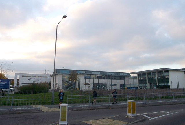
Image result for harris academy chafford hundred


Harris Academy Chafford Hundred is a secondary school and sixth form with academy status located in Chafford Hundred in the borough of Thurrock within the commuter belt of London, England, United Kingdom.
AddressMayflower Rd, Chafford Hundred, Grays RM16 6SA

The location is a suitable place cause there a wide range of props that i can use within my photos such as different dance studios if needed,office settings,fields there are a lot of setting i can use to boost my photography to benefit my craft which is a extremely useful tool to have for a photographer.

the risks and hazards are that the school is a extremely busy place with a lot of younger kids which may interrupt my photography or even damage camera parts  which can severely affect my schedule and push back some of times i meant to be doing some of my camera work which could delay my production of my tasks which is the main issue that i can encounter also since its busy they could interrupt my photo which can make me to continue doing re shoots also some of the places i may want to use may have a class inside which can be annoying.

Tuesday, 5 June 2018

Post 13 sketching and product profiling

objective:

This task is about the importance of sketches and planning when creating a magazine while remembering to include my stylistic influence into the magazine also.


Front Cover Designs:


This first design was a simple layout which multiple fashion magazine layout with main picture on the front with title on the top with a logo , also with the stories on the side which are littered and ment to catch a persons eye since they are also bright against the background.People i showed this to said the layout is what you expect from a magazine but seems too tacky and generic and doesnt show your own creative prowess within this layout.


This second iteration has a little changes such as having little lines of whats in the magazine along the left side  so i moved the main stories to the right side to keep each side even with text rather than one side being so text heavy which makes the front cover look odd.I shifted the title to the middle underneath the logo to keep it centralised.


This is my final design i wanted to reduce all the jargon on the front cover because my magazine is about fashion and i want the fashion used on my cover to be appreciated which is in line with the responses i got the 5 people i asked said this version reflects my creative decisions because its elegant and simple and not over the top which is what i want my magazine i want it to stand out because its sleek ad elegant not because it has a lot of exclamation marks and bright text to catch the eye of the reader i still keep my main stories but i spread it across the entire front page and they wont be intruding on the front main picture.i moved the title to the bottom so people can appreciate the fashion its self and  i reduced the size of the barcode and issue number.


Contents page designs:


This contents page is the generic version of what you would typically see within a magazine a list of page numbers and what its on the page with a plain white background i again received a response of it looking generic.


This second iteration has the main features of the magazine highlighted and numbered rather than majority of articles in the magazine which is a but overkill and i want the contents to reflect the minimal styling of the front cover which keeps the style consistent through the magazine. i also opted to use another picture of my model rather than use a plain white background to keep the aspect of fashion everywhere even in the contents page.


This is my final design i have updated it to look more modern or even futuristic by having 3 different categories with a ring around it with a colour for each one so fashion stories is blue, fashion styles is yellow and alternate fashion is red so i just want to keep main features for each one to make it easier to read and looks more updated rather than a basic list with no colour and above us the models photo aswell.


Website draft:


1st design:
This was my original website design its extremely basic which has all the fundamental elements such as a scrolling side bar which a lot of websites have which has all the latest fashion stories which people may find interesting for a quick read.I wanted to go for a big square design for the main stories in a tile like format to keep it simple and easy to understand also i had bars at the top which have different options to what readers want to read.


2nd design:
This updated design has new elements into it such as more option on the category bar such as celebrity fashion,culture fashion and general fashion styles which has more options for people to look at, i kept the left side latest news scroller which i wanted to keep and i had my main first block with most popular stories so people know what alot of other readers are reading which can inspire more readers and also can use those popular stories to inspire more fashion ideas and also possibly lead to the magazine receiving endorsement and sponsorship which can boost the magazines status.


3rd design:
This is my final design i added more into the category bar such as a webshow each week which can keep even more readers involved which introduces fashion concepts and styles included a overall search bar so other categories can be found without clustering the main category bar so people can find exactly what they want.i wanted to keep other stories underneath also.


Monday, 4 June 2018

Post 12 -mood board

Objective:
Create a series of mood boards (at least 2 - one for the main product and another one for the online counterpart) that give an indication of the types of images (may include photos and/or illustrations), overall colour scheme, types of fonts and colours you are considering using in your productions. When you finish the mood boards you need to analyse them answering the following questions:
• How did they helped you define content for your products?
• What will be your overall colour scheme of your productions?
• What kind of images/shots would you use in your productions?
• What kind of fonts would you use in your productions?
• What kind of mise-en-scene would you use in your productions?
• What kind of intertextuality would you use in your productions?
• Which media theory(ies) are you likely to use in your productions?


I chose brief 3 which is to create a 2 magazine front covers and a contents page and a corresponding website and i need to have all 3 items a minimum 2 covers and website.The brief gives us the target audience of 16-25 class A and B and sophisticated.I have chosen my target audience to be age 18-22 male  specifically.

For this specific task im going to present the different fonts, styling that im going to use in my magazine and im gonna show how they connotate to the reader so i can convey a read take on my magazine and see how people interpret the magazine.I also allows me to convey my own creative inspirations and creativity i an apply to my magazine.


Cover 1 Mood board:


My main cover is going to have inspiration from fall designer campaigns which follows the more darker tone backgrounds which have unique backgrounds which helps them stand out and look different the font im going to adapt is going to be similar the the givenchy font i want it to be classic and simple with out overdoing it to appeal to the posher upper classes i want everyone to look at it so it will be iconic for its simplicity. i want to apply a unique back ground for my mise en scene which will probably lead me to use photoshop so i can apply the background to the photo of my model.Im going to use mainly whole body shots to have a full outfit which people can see and so the whole outfit can contrast with the background.I want my cover to link to a bit of fantasy such as things like supernatural fantasy like vampire diaries and twillight to impose that kind of feel and look.


Cover 2 mood board:


The second cover is going to be more black focused its going to be inspired from hip hop culture which is its mainly intertextuality which allows my magazine to show another side of the spectrum when it comes to fashion the more smart fashion and then the more casual fashion.For this cover i would like the font to be the same but gold instead since it can represent gold chains which are a staple for black hip hop culture.I want the mise en scene to be different i want a more red carpet premiere with the back ground which is used for music events just to keep the theme of the look going. Im going to keep the full body shot so the whole outfit can be seen.


Website mood Board:


The website mood board has a range of different fashion websites for inspiration the main website designs im influenced by is vogue and elle because they keep a simple black and white monotone which reinforces class and sophistication which is meant to be our target audience so using some of those concepts can be used for my own website.in addition the font used on the website is almost universal with mainly black modern fonts to keep the text easy to read also the layouts are also simple to not confuse readers by overcomplicating how the website works.


magazine conclusion:
The information i have collected has been useful because it showed me peoples expectations of a fashion magazine such as a female on the cover and a plain white background which i want to defy peoples expectations so that it will be different even with i had more females i want more males to be interested in fashion magazines so it doesnt become so gender locked for only women to enjoy fashion magazines.In addition my tone for the magazine is going to be light hearted and not to serious and critical because i want my magazine to appeal to new and old magazine readers so it wont lose either markets.The style of fashion i wanted to do was debated between us fashion and  european fashion but from the data gathered im going to focus on european fashion but i will include other culture fashions also.The more younger people made me want to appeal more to the younger age range which i can relate to myself.


I HAVE CHOSEN; my audience to be 18-22 year old males with the socio economic groups of a and b but i also want my audience to be motivated to achieve some of the more expensive fashion magazines.I want my audience to like smart clothes but to prefer more causal clothing such as t shirts sweatshirts,jeans and more of those fashion tropes which can include european designers


UPDATE for cover1:


This picture above was the one which added a new development since he just had the glasses himself.


My original concepts have received a new inspiration as i was taking my photos with my model he had glasses on which made me think of hippies and that hipster style which i decided to adapt my original concepts to show my media ability to adapt to new inspiration so i decided to still follow the Givenchy style of modern clothes and showing elegance but i adapted the hip hop style to a new hipster john lennon adapted intertexuality because i feel that my model has brought new inspiration brought to me that i want to bring to reality because also it allows me to explore a genre of media im not familiar with myself so it gave me a chance to explore.


Update for cover 2:


i kept the same theme with the hip hop casual style with designer i wanted to keep this and my model represents the original idea.

Post 11 Audience profile

Objective:
Create a surveymonkey asking potential audiences what they expect / prefer to see in the products of the same brief you chose. Review your results and copy and paste some relevant graphs.
 • What did you find useful about the information you collated?
• How are you going to use the information you collated to establish a target audience for your product?
• What does the target audience expect to see in the product you’re going to create?
• How are you going to use the information collated to come up with designs and house style for your product.

My Audience


click the following link takes you to my questionnaire:

https://www.surveymonkey.co.uk/r/78C8LWB

https://www.surveymonkey.co.uk/r/LBT7XQM


magazine survey data:


This just shows the larger demographic of younger people who participated within my survey which is mainly 15-17 and only 1 was 18 or older.


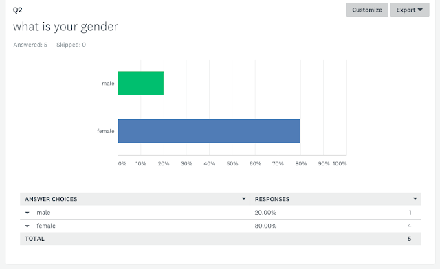
had mainly female participants within my results which is mainly due to the environment which it was conducted in.Which could show perhaps i could have the idea of pursuing more female fashion aspects rather than just men.


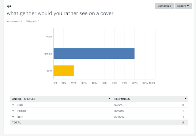
80% of the people preferred to see a woman on the cover which can relate to the higher amount of women who participated in my questionnaire which could be a representation to what people expect from a fashion magazine for it to be female oriented.


Again 80% followed the expected trends of having a plain white background as the cover which is something i want to be excluded from i want my magazine to be different from expectations which is why im not going to have a white plain background.


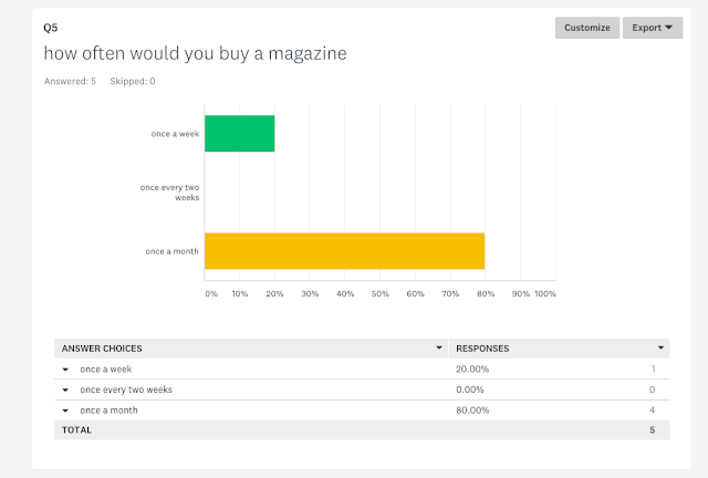
Majority of people who did my questionnaire chose that they would buy a magazine once a month which is typical in relation to the younger participants since the younger generation do more reading on their phones rather than picking up a book or magazine which just reflects how technology has influenced paper editions of media.


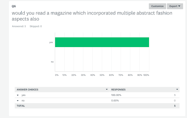
100% of People want to see some of the extreme fashion ideas which are unusual fashion styles.


All my participants want to see everyday fashion which are common so more my audience can relate to.


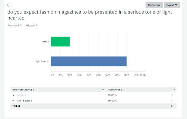
This shows that the magazine should adopt a light hearted jokey kind of tone and not to seem so diehard and serious about fashion and to appeal to a more friendly and accessible to everyone who wants to pick up and read a magazine for the first time.


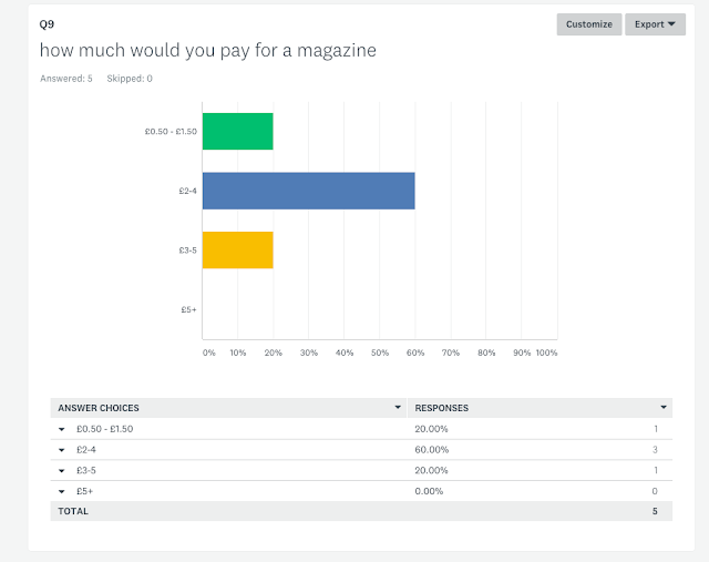
£2-£4 option is the most popular option which is seeming like a fair price for a magazine so it can be competitive with other magazines which have already established a fanbase so a penetration pricing should be used to enter the market.


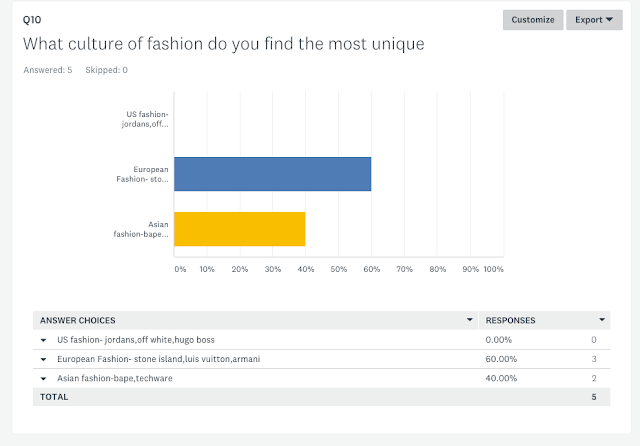
60% of my participants chose to have european styles which i thought would of been more of the american brands but european fashion is more iconic within the uk rather than american brands.


website survey data analysis:


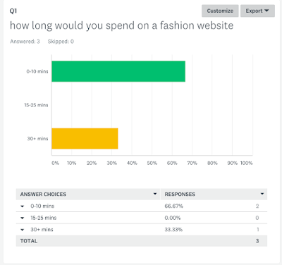
My survey allowed me to gather that people wouldnt spend so much time on a fashion website the time indicated 0-10 mins suggests that people will read one or two fashion articles and thats it which shows that my articles may have to be snappy and quick to read.


All my answers are equal here but more options to visit a website couple times over a two week period and not a daily visit.which shows that people may prefer a larger fix of fashion news over a couple weeks.


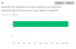
This survey shows that people want the option to buy some of the fashion wares and this was useful because my magazine involves more expensive fashion ideas but people seem to still want the links and even for celebrity clothing that isnt exclusive to them.


allows me to cater to peoples budgets possibly even have categories of fashion in relation to price but still mainly keeping designer as a fundamental part.


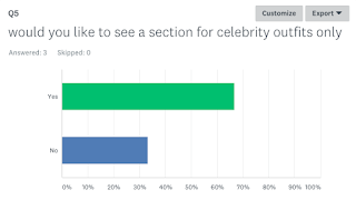
More people said yes to this idea which makes me want to go through this idea more to embrace hip hop fashion trends etc.


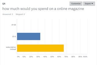
Using a subscription is a modern way to retain customers since you can have a low price but they still keep reading the magazine and they stay updated with whats going on with the online magazine.


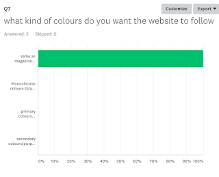
Going to keep the website same as the maagzine for the theme of it.


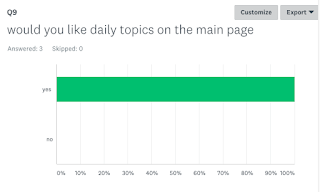
People want new updates each day so they are aware of the constantly changing fashion world.


Mainly same as the magazine counterpart question same age group answering the survey.


magazine conclusion:
The information i have collected has been useful because it showed me peoples expectations of a fashion magazine such as a female on the cover and a plain white background which i want to defy peoples expectations so that it will be different even with i had more females i want more males to be interested in fashion magazines so it doesnt become so gender locked for only women to enjoy fashion magazines.In addition my tone for the magazine is going to be light hearted and not to serious and critical because i want my magazine to appeal to new and old magazine readers so it wont lose either markets.The style of fashion i wanted to do was debated between us fashion and  european fashion but from the data gathered im going to focus on european fashion but i will include other culture fashions also.The more younger people made me want to appeal more to the younger age range which i can relate to myself.


I HAVE CHOSEN; my audience to be 18-22 year old males with the socio economic groups of a and b but i also want my audience to be motivated to achieve some of the more expensive fashion magazines.I want my audience to like smart clothes but to prefer more causal clothing such as t shirts sweatshirts,jeans and more of those fashion tropes which can include european designers.


post 17 - final pieces